Helvetica Font
The Helvetica Font: Complete Guide to the World’s Most Essential Typeface
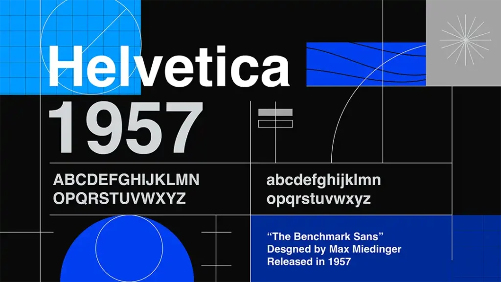
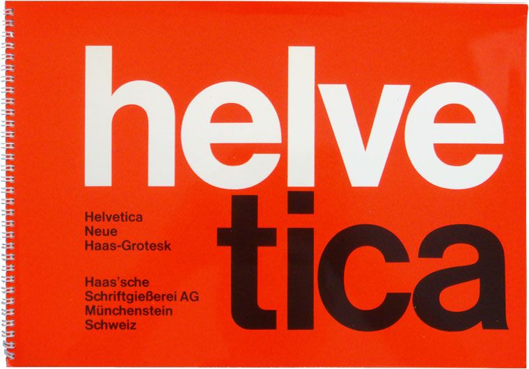
Recognized as one of the most influential sans-serif typefaces globally, Helvetica remains a cornerstone of contemporary design excellence. Its refined simplicity and outstanding readability make it the preferred choice for demanding graphic projects, spanning from brand identity systems to digital interfaces and urban wayfinding solutions. This legendary typeface derives its name from the Latin term for Switzerland, and its original latin name was ‘Neue Haas Grotesk’ the new font developed by Max Miedinger and Eduard Hoffmann before being renamed Helvetica in 1960.
Switzerland’s reputation as a leader in modern graphic design and typography is closely tied to Helvetica’s origin and influence. Helvetica’s universality extends across industry sectors and cultural boundaries, establishing itself naturally in diverse fields including finance, technology, and corporate communications. Its neutral character enables remarkable adaptation to all types of messaging, whether institutional or creative in nature.
Historical Origins and Development of Helvetica Font
Helvetica’s story begins in 1950s Switzerland, where Max Miedinger and Eduard Hoffmann collaborated at the Haas Type Foundry to create what would become one of the most significant typographic achievements of the twentieth century. Arthur Ritzel also made substantial contributions to this revolutionary typeface’s development. Originally christened “Neue Haas Grotesk,” it received its definitive name “Helvetica” in 1960 through Linotype Corporation’s initiative, who handled its international distribution. Helvetica was developed in the same year as other significant typefaces, such as Univers, highlighting its emergence within a pivotal moment in design history.
Stempel AG actively participated in Helvetica’s commercialization and various adaptations, contributing to its global expansion. The typeface’s meteoric success stems from its progressive design philosophy and exceptional versatility across applications. It rapidly became the emblematic representation of the International Typographic Style, commonly known as Swiss Style, which championed clarity, simplicity, and design objectivity during the mid-twentieth century.
Throughout subsequent decades, Helvetica has experienced numerous refinements and technological adaptations to satisfy the evolving requirements of designers and emerging technologies. The creation process of new Helvetica versions, including Helvetica Neue and other derivative fonts, involved extensive test proof methodologies, these test proofs were essential for evaluating the font’s legibility and consistency before commercial release, to perfect the typeface’s design while ensuring optimal legibility and stylistic consistency.
New versions, such as Helvetica Rounded and Helvetica Narrow, were released to address specific design needs and expand the font’s versatility. Each new iteration’s development was meticulously documented by its creators, demonstrating their unwavering commitment to quality and attention to detail. Digital adaptations of Helvetica have been carefully crafted to ensure seamless compatibility with contemporary digital platforms and advanced printing technologies. A recent update, Helvetica called Helvetica Now, introduced variable font technology and new optical sizes, further enhancing the font’s adaptability for modern display requirements.
Despite countless alternative typefaces emerging over time, Helvetica continues as one of the world’s most extensively used and instantly recognizable fonts, with its timeless aesthetic continuously influencing modern typography and graphic design practices. The font’s characteristics have evolved to meet the needs of different media and industries, ensuring its ongoing relevance and widespread recognition.
Distinctive Characteristics of the Helvetica Font Family
The Helvetica font family distinguishes itself as an exemplary sans serif typeface, renowned for its contemporary aesthetics and remarkable adaptability. Among its most defining attributes is an elevated x-height, which significantly enhances readability while providing letters with a harmonious and accessible appearance. The font’s precise horizontal and vertical stroke endings, combined with characteristically condensed inter-character spacing, produce a compact, substantial visual presence that is simultaneously impactful and highly functional. While this tight spacing is a hallmark of classic Helvetica, Neue Helvetica introduced increased spacing, especially in the numbers, to further enhance legibility and visual balance. This adjustment contributes to the overall clarity and readability of the typeface in various applications. This tight spacing contributes to Helvetica’s capacity for efficient information communication, making it invaluable for signage, branding initiatives, and advertising applications where clarity remains paramount.
Drawing inspiration from nineteenth-century Akzidenz Grotesk and other foundational German and Swiss typefaces, Helvetica was conceived to embody neutrality and minimalism. Its streamlined forms and absence of decorative elements enable seamless integration across diverse design contexts, from traditional print to modern digital media. The font’s structural integrity ensures maintained legibility across various scales, further reinforcing its reputation as a versatile typeface appropriate for everything from corporate identity systems to public navigation networks.
Helvetica’s matching designs across multiple weights and styles ensure visual harmony and brand uniformity, making it especially effective for cohesive branding and signage. Consequently, Helvetica has established itself as one of the world’s most extensively utilized fonts, trusted by designers for its dependability and enduring aesthetic appeal.
Global Recognition and Corporate Applications
Helvetica stands as one of the most universally adopted typefaces worldwide, distinguished by its pristine and modern visual character. Its neutrality and exceptional legibility render it suitable across multiple languages and cultures, driving its widespread acceptance throughout various countries and industries. Helvetica supports an extensive range of scripts, including Latin and Cyrillic alphabets, making it highly versatile for multilingual and regional typography requirements. In addition, some organizations and designers have created their own version of Helvetica to support additional scripts or to meet unique branding needs.
The use of Helvetica as a premier sans-serif typeface is evident in branding, signage, and government applications around the world.
Corporate and B2B Applications
In the corporate landscape, Helvetica has become synonymous with professionalism and reliability. Major financial institutions including JPMorgan Chase, Goldman Sachs, and Deutsche Bank have adopted Helvetica variants in their brand communications, leveraging its authoritative yet approachable character to build trust with stakeholders. The typeface’s clean geometry and neutral personality make it ideal for quarterly reports, investor presentations, and regulatory documentation where clarity and credibility are essential.
B2B technology companies particularly value Helvetica’s ability to convey innovation without sacrificing readability. Enterprise software platforms, SaaS providers, and cloud computing services frequently employ Helvetica in their user interfaces and marketing materials, recognizing its capacity to communicate complex technical concepts with clarity and sophistication. Major technology companies, including Microsoft, have also utilized Helvetica in their user interfaces, product packaging, and marketing materials, emphasizing its modern and corporate appeal. In addition, Neue Helvetica served as the system font in certain Apple operating systems before being replaced by San Francisco, making it a key visual element in Apple’s user interface design.
Financial Services and Defense Industries
The financial sector’s embrace of Helvetica extends beyond traditional banking to encompass fintech startups, investment management firms, and cryptocurrency exchanges. Its mathematical precision and structured appearance align perfectly with the industry’s emphasis on accuracy and trustworthiness. Trading platforms and financial dashboards benefit from Helvetica’s exceptional legibility at small sizes, crucial for displaying real-time market data.
Defense contractors and government agencies have similarly adopted Helvetica for its no-nonsense aesthetic and excellent performance in mission-critical applications. The typeface’s clarity under stress conditions makes it valuable for control systems, technical manuals, and operational interfaces where information accuracy can be life-or-death important.
Prominent Usage Examples Across Industries
Metropolitan Transportation Systems: Helvetica serves as the primary typeface for New York City’s subway infrastructure, appearing on station identifiers, directional markers, informational displays, and printed materials across the extensive transit network. The font’s exceptional clarity and readability prove essential for communicating vital information to millions of daily commuters and tourists navigating this complex transportation system. Helvetica’s distinct letterforms and legible word structures are fundamental for effective wayfinding in such demanding environments. Helvetica is displayed on both digital screens and printed signage throughout the subway system, ensuring legibility and consistency at various sizes and under different lighting conditions.
Federal Mail Services: Helvetica appears prominently on United States Postal Service collection receptacles, which serve as recognizable landmarks throughout American urban and suburban landscapes. The typeface is featured in the distinctive “U.S. MAIL” branding on container fronts, alongside informational content and regulatory instructions concerning postage requirements and mailing procedures. Its straightforward and unambiguous design guarantees that essential postal information remains easily accessible to customers. For enhanced visibility, heavier punctuation elements and bold variants, including extra black weights, are frequently employed.
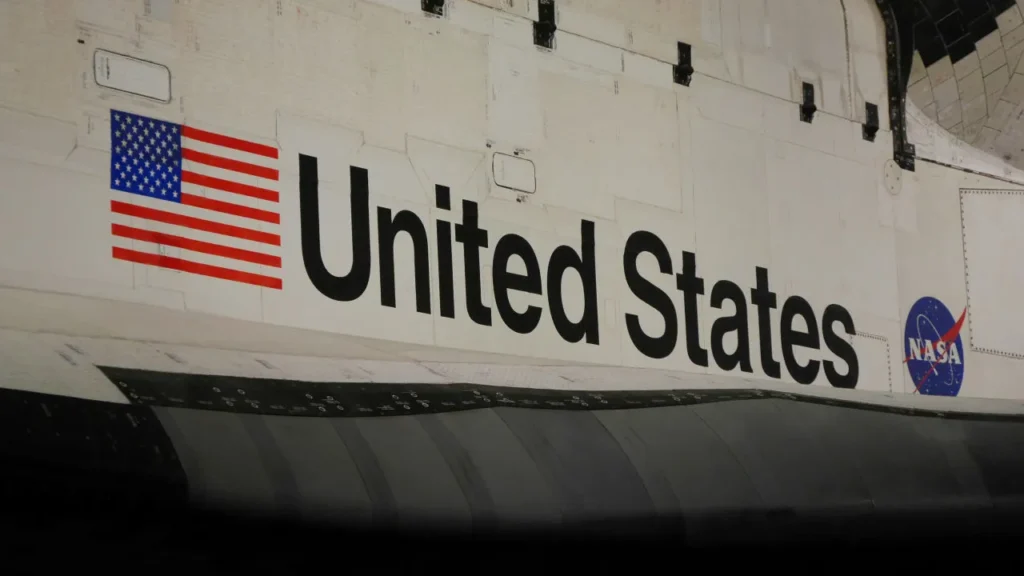
Aerospace Applications: NASA has utilized the Helvetica typeface extensively throughout decades of space exploration missions. The iconic “United States” wordmark adorning Space Shuttle payload bay doors exemplifies this application. Implementing this minimalist sans serif font on spacecraft conveyed modernity and technical expertise, reflecting the sophisticated technology and scientific precision synonymous with NASA’s space exploration endeavors, while Helvetica’s characteristic letter shapes ensured crucial visibility.
Helvetica in New York: The City’s Enduring Typeface
Few cities in the world have embraced Helvetica as wholeheartedly as New York. This iconic sans serif typeface has become synonymous with the city’s ultra modern graphic design, shaping everything from subway signage to luxury brand identities. New York’s adoption of Helvetica is a testament to the typeface’s versatility, modern appearance, and ability to convey clarity in even the most complex urban environments.
The story of Helvetica in New York is closely tied to the city’s quest for a unified, legible, and contemporary design language. In the 1980s, legendary designer Massimo Vignelli led the overhaul of the New York City Subway’s wayfinding system, selecting Helvetica for its unusually tight spacing, solid appearance, and exceptional legibility. The result was a signage system that not only improved navigation for millions of daily commuters but also set a new standard for public information design. Helvetica’s high x-height and clean, horizontal lines made it the ideal choice for signage that needed to be read quickly and accurately in bustling, crowded spaces.
The city’s dynamic design scene has also inspired the evolution of Helvetica itself. As designers in New York and beyond pushed the boundaries of what a sans serif typeface could achieve, new versions like Neue Helvetica and Helvetica Now emerged. These updates introduced improved legibility, heavier punctuation marks, and a more structurally unified set of styles, ensuring that Helvetica remained at the forefront of contemporary design. The release of these digital versions has allowed Helvetica to adapt seamlessly to new media, from mobile apps to large-scale digital displays, further cementing its status as one of the most popular typefaces in the world.
Helvetica’s cultural impact in New York extends beyond the design community. The documentary film “Helvetica” by Gary Hustwit, which features interviews with influential designers including Vignelli, brought the typeface’s story to a global audience and highlighted its role in shaping the city’s visual identity. The film’s exploration of Helvetica’s use in New York’s signage, advertising, and branding has made the typeface a household name, recognized by designers and non-designers alike.
Today, Helvetica continues to define the look and feel of New York. Its presence on street signs, storefronts, and digital screens is a constant reminder of the city’s commitment to clarity, innovation, and contemporary design. As new versions and digital adaptations emerge, Helvetica’s legacy as a versatile typeface only grows stronger, inspiring designers to create their own versions and ensuring its place as a cornerstone of modern typography. In New York, Helvetica is more than just a font, it’s a symbol of the city’s enduring spirit and its ongoing influence on the world of graphic design.
Digital Evolution and Modern Adaptations
As design paradigms shifted from traditional print to digital environments, Helvetica evolved to accommodate new technological demands and platform requirements. Digital iterations of Helvetica, including Neue Helvetica and Neue Helvetica World, were engineered to ensure optimal compatibility with contemporary user interfaces and diverse linguistic systems. Each digital version of Helvetica is tailored for specific platforms and use cases, addressing the unique requirements of web, mobile, and software environments. These enhanced versions introduced expanded weight ranges and stylistic options, along with improved on-screen legibility, establishing Helvetica as the premier choice for digital typography applications.
Neue Helvetica World specifically broadened the font’s global reach by incorporating support for multiple languages and writing systems, enabling brands and designers to maintain consistent visual identity across international markets. Monotype Imaging played an instrumental role in these technological advances, refining Helvetica’s design for digital contexts and ensuring crisp, precise rendering across screens of varying sizes and resolutions. The outcome is a typeface that transitions effortlessly from print to digital mediums, preserving its clean, neutral aesthetic and functionality across websites, mobile applications, and digital display systems. This digital optimization has cemented Helvetica’s position as the preferred typeface for user interface design and contemporary graphic design projects worldwide.
Comparative Analysis with Alternative Typefaces
Helvetica undergoes frequent comparison with other prominent sans serif typefaces, particularly Arial and Akzidenz Grotesk. While Arial was developed as a metrically equivalent substitute for Helvetica, it lacks many of the nuanced refinements and structural coherence that characterize the Helvetica font family. Akzidenz Grotesk, a nineteenth-century precursor, provided key inspiration for Helvetica’s creation, yet Helvetica’s design introduced enhanced structural unity through matching design elements, resulting in superior legibility and more cohesive visual presentation.
The original Neue Haas Grotesk, subsequently renamed Helvetica, established new standards for sans serif typography through its balanced proportions and exceptional versatility. Over time, the Helvetica font family has expanded to encompass versions like Neue Helvetica, Helvetica Neue, and Helvetica World, each offering additional stylistic options and enhanced functionality for modern graphic design applications. Compared to alternative fonts, Helvetica maintains its reputation for versatility, clean aesthetics, and remarkable adaptability across diverse applications, from corporate branding to public signage systems. Its influence on typography and graphic design remains unparalleled, inspiring countless derivative fonts while maintaining its status as one of the most widely recognized and utilized typefaces globally.
The Future Legacy of Helvetica Typography
Helvetica’s evolution from its Swiss design origins to widespread digital adoption demonstrates its enduring influence and remarkable adaptability. As a timeless and versatile typeface, Helvetica continues shaping the visual landscape across print and digital media, inspiring designers, artists, and communication professionals worldwide. Helvetica also continues inspiring creative writing and expression in ultra-modern graphic design, embodying a sophisticated and forward-thinking approach that defines contemporary visual communication standards. Its legacy serves as a testament to typography’s power in transcending cultural and technological barriers, leaving a permanent impact on the design world.
The convergence of traditional design excellence with digital innovation positions Helvetica as an eternal symbol of typographic achievement, seamlessly bridging historical craftsmanship with contemporary creative expression through captivating visual narratives. This represents both a celebration of design history’s rich heritage and Helvetica’s enduring influence, perfectly blending nostalgic appreciation with modern creative innovation.